Tutorials
How To Influence Customer Behaviors the Right Way
Written by James Hooper
Nudge is a method for predictably altering behavior without restricting options or significantly changing incentives.
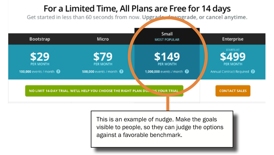

Nudge is a method that blends web design and psychology to help alter and entice users to make the most favorable decision. Consumers will often compare the product in question to other comparable models. Most shoppers look for a middle ground. A business can increase their profits by adding another option to the top end so that customers are nudged towards the middle option.
By narrowing down the options, the customer can easily see the path you want them to take. Highlighting the most beneficial option will sway them in the most favorable direction.
In Summary, nudge is a design tool that influences behavior in a predictable way without compromising options or incentives. Users have a tendency to follow the path of least resistance, which leads them to a more desirable outcome.
How to Design and Simplify Web Forms Using Progressive Disclosures
Written by James Hooper
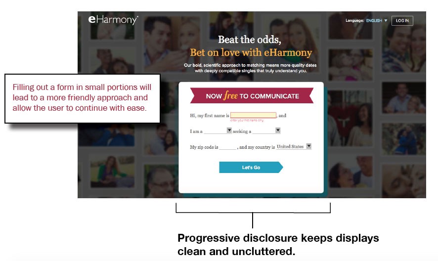
Filling out a form in small portions will lead to a more friendly approach and allow the user to continue with ease.
How often have you run into a web form that is so long and tedious, that you begin losing interest quickly and grudgingly? Web forms do not have to be dreadful. Progressive Disclosure is our next design principle that keeps displays clean and uncluttered. This allows for a more intuitive and user- friendly approach.
Filling out a form in small portions will lead to a more friendly approach and allow the user to continue with ease. Information that is gradually disclosed to the user is better processed and perceived as more effortless. This is exactly what you want in a web form. Encourage users to continue further on and display a progress bar to help show the end is near.
The following illustration shows an example of how to break up large amounts of information one at a time.
How To Help Guide Users with the Fewest Clicks
Written by James Hooper
Wayfinding is the process of using spatial and environmental information to navigate to a destination in the fewest clicks possible.
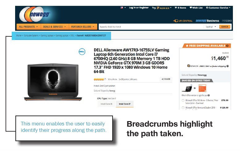
Wayfinding is a critical component to helping the user find his or her way around large websites.
It is important to show the user where he is at all times in any website your create. Users don't have the patience to figure out where to go next, if you don't make it obvious.
Menus are the most important part of a website. The best way to inform and locate the user is by using breadcrumbs to highlight the path taken. This allows the user to easily jump to different locations with fewer clicks.
Wayfinding is best described as a process that helps locate and lead the user to a web page in the most straightforward way possible. It helps locate the user in relation to the overall site. Breadcrumb navigations will enhance the way users find their way around large websites. This helps improve usability and findability.
People often scan web pages for information, and rarely reads every single word on the web page. It is our job as web designers to make the information easy to access and make it easy to find. I encourage you to use wayfinding as much as possible in every project you work on.
How to Design a Website Using Similarity as a Design Principle
Written by James Hooper
The web designer's job is to provide visual clues as to which elements are related to one another for better clarity.
Elements on a webpage that are similar are perceived to be more related than elements that are dissimilar. The web designer's job is to provide visual clues as to which elements are related to one another for better clarity. This is especially important in supporting the relationships among interface elements.
The user has limits to the amount of information that one can keep track of. When the amount of visual information becomes overwhelming the mind tries to simplify by grouping. Web designers can use a few colors and shapes to gain the strongest effects. This will ensure that interface elements are distinct and easy to detect. Constructing similarities will help improve the user experience.
Take a look at the following illustration that uses similarity:
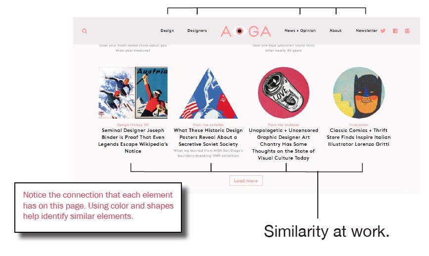
Similarity is a powerful grouping concept that achieves unity and defines groups more clearly. This helps distinguish elements from the rest of the web page.
Mastering Web Design:
Design Your Own Hero Section
Written by James Hooper
The hero section is the most important section of a website's homepage, as it is the first thing that visitors see when they land on the page.
A well-designed hero section can grab the visitor's attention and encourage them to explore the rest of the website.
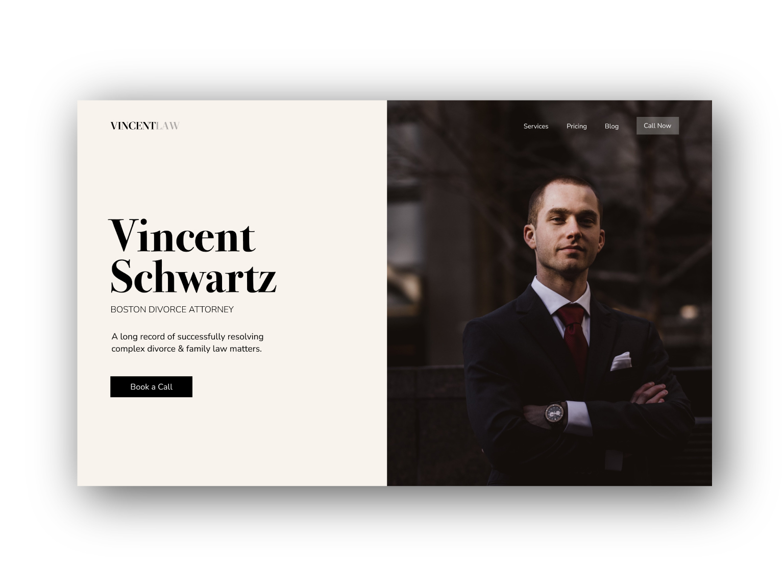
Your hero section must answer these three questions:
• What is this website about?• What am I getting out of this website?
• And how do I get it?
It's very important to have a clear message in your hero section. Here are some tips on how to design the perfect hero section:
Keep it simple:
The hero section should be simple and uncluttered. It should convey the website's message clearly and concisely.
Use high-quality images:
Use high-quality images that are relevant to the website's message. The images should be visually appealing and should grab the visitor's attention.
Use a clear and concise headline:
The headline should be clear and concise, and it should convey the website's message in a few words.
Use a call to action:
The hero section should include a call to action that encourages the visitor to take an action, such as signing up for a newsletter, booking an appointment, or exploring the website further.
Make it responsive:
The hero section should be responsive and should look good on all devices, including desktops, laptops, tablets, and smartphones.
Test and refine:
Finally, test the hero section and refine it based on user feedback and website analytics. Use A/B testing to test different versions of the hero section and see which one performs the best.
By following these tips, you can design the perfect hero section that grabs the visitor's attention and encourages them to explore your site further. You will certinaly be on your way to capturing more leads than ever before.
